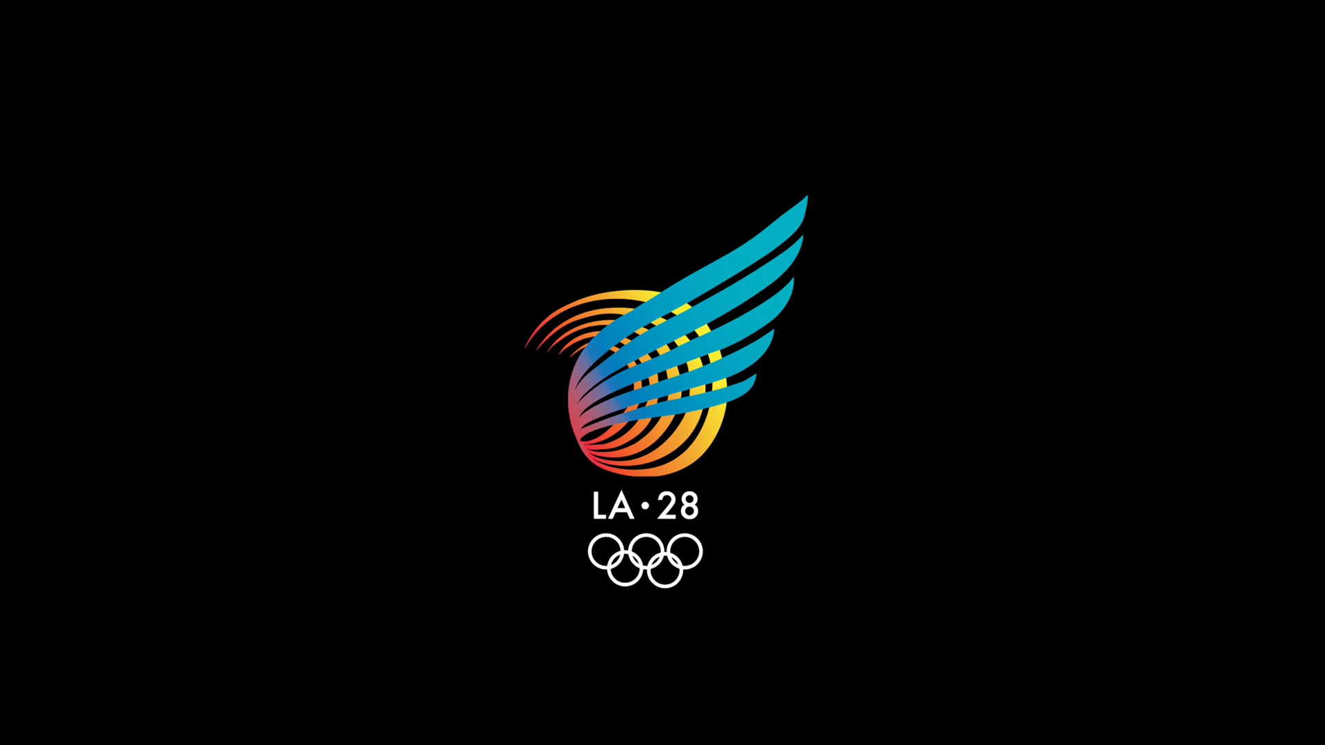
LA 28: Where Dreams Take Flight
Established a strategic approach to a branding system for the 2028 games centered around the big idea of "Where Dreams Take Flight." The logo was designed to highlight the symbolism of the visual element of a wing, tying in the idea of the “city of angels” and the five lines that make up the wing represent the five Olympic rings. This wing visual is used throughout various collateral elements in order to mimic the dynamic movement of the athletes in motion.
